HTML5 Accessibility redesign
This redesign went up a couple months ago, but finally getting around to sharing here. David Storey and I (as Microsoft Edge team members) worked on a structural and aesthetic update to the HTML5 Accessibility website, a project created by The Paciello Group, an accessibility consultancy.
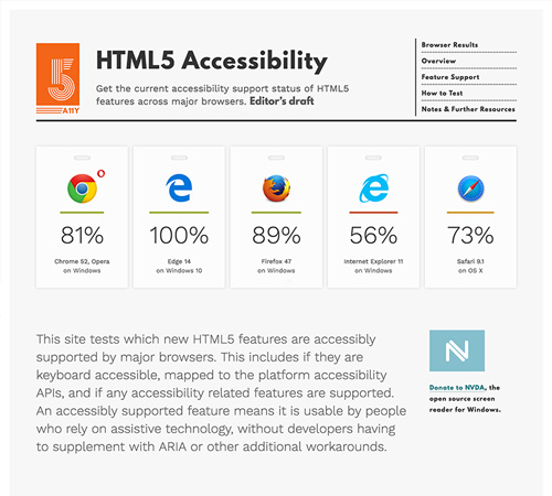
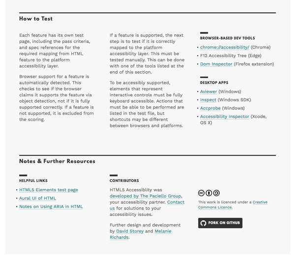
The site shows whether or not browsers have implemented HTML5 features accessibly, such that users of assitive technology can interact with web content successfully. This of course helps inform web developers of potential issues to look out for, but the test pages also allow browsers to verify that they've implemented features correctly.
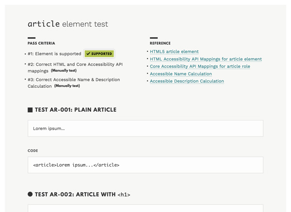
We started the redesign of the HTML5 Accessibility site in an unconventional place: on the structurally simplest pages. The test pages are what browser vendors use to verify if they've implemented a feature accessibly. That means that while they should look nice and be a pleasant experience, it was important to us to restrict the markup only to what was absolutely necessary to render the information and tests—no extra HTML crufting up the screen reader or tabbing experience. We chose to start the design here where the code style was more restrictive to ensure that our design styles worked in this reduced form.
The large numeral 5 is made up of 5 lines.
It is difficult to capture just how many ways people interact with web content. Instead of trying to jam all these accessibility concepts into one small mark, I opted for a more graphical representation of a unified effort.
The orange color of this project's logo is a nod to the W3C's branding for HTML5.
Our redesign of the main site was more than a re-skin. We restructured content so that:
- It was quicker to understand the purpose of the site
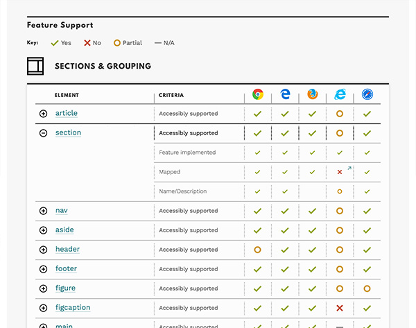
- The user could see inline in the table where accessibility support failed (expanded table row gives extra detail)
- The user could look at the set of elements they are interested in, instead of looking at one giant table
This was a fun site to work on, and I'm glad Steve Faulkner (of The Paciello Group) was interested in having us pitch in! You can see the live site at html5accessibility.com.