First Impressions of Forced Colors Emulation
Note: this post assumes familiarity with forced colors modes styling and Windows High Contrast, now called “Contrast Themes” in Windows 11. Refer to “Styling for Windows high contrast with new standards for forced colors” for a primer.
Brief summary of forced colors modes
Forced colors modes enable a person to view digital content rendered in exactly the color scheme of their choosing. Browsers that support forced colors modes render all web content in the user’s colors, taking HTML semantics into account in order to apply the right semantic colors. Web developers don’t need to do anything for colors to be forcibly applied, but can optimize their web content for best styling in this mode.
Recently I was delighted to learn that forced colors emulation is available in the Chromium DevTools, as of Microsoft Edge v98! 🥳 I’d been eagerly anticipating this moment for quite some time: when we were first working on forced colors in Chromium, the Microsoft Edge web platform and DevTools teams were excited about the prospects of bringing emulation to developers on any OS platform. No longer would you need a PC or test tooling like Assistiv Labs in order to understand what your web content might look like in Windows High Contrast (“Contrast Themes” on Windows 11). Developers on Windows also wouldn’t need to force their entire system into a contrast theme in order to test their content. And now: emulation is finally here!
Playing with the new feature
I now work at Netlify, and learned that forced colors emulation was available right before an internal hack day. That posed the perfect opportunity to audit our components for forced colors mode optimization, and try the new emulation feature. Several colleagues joined the project, to my delight and the project’s benefit; all of them have Macbooks and were game to test drive the new emulation tooling.
After a quick demo of how Contrast Themes actually looks and feels on a Windows machine, we set to work auditing components using the Chromium DevTools. To use forced colors emulation, you would navigate to the “Rendering” tab in DevTools > “Emulate CSS media feature forced-colors” > Select “forced-colors: active”.
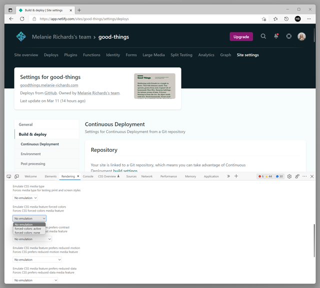
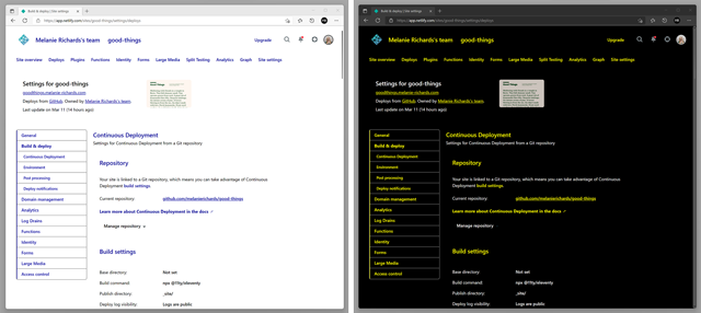
The page will now behave as if this media query evaluates as true. If you’re in light mode, a forced light theme will be applied. Change over to dark mode, and you’ll get a white-on-black theme:
These themes basically follow a user agent default stylesheet. If you pull up System Colors in the CSS Color Level 4 spec and enable forced colors emulation, you’ll get a palette of system color swatches:
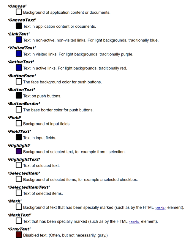
Note that the array of colors actually used by Contrast Themes on Windows is smaller than the list above:
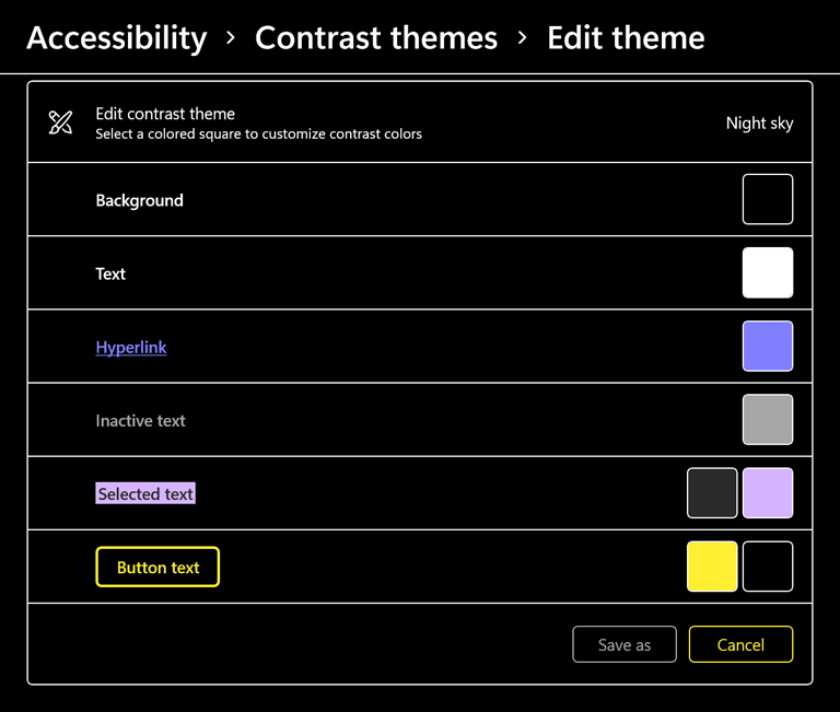
Here’s an example of that theme being applied to my operating system and browser on Windows:
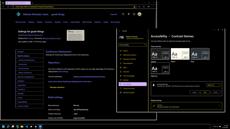
Developers and designers should limit themselves to the following list for now:
CanvasTextandCanvasLinkTextButtonTextandButtonFaceHighlightTextandHighlightGrayText
Moar themes, please!
I am ecstatic that forced colors emulation is available to all today, and I would say the main limitation is precisely that a default user agent stylesheet is applied, for a few reasons:
Doesn’t give an accurate sense of what a user will experience
The beauty of the Contrast Themes feature on Windows is that it enables the user to select whatever theme they wish. Forced colors are very useful for low vision individuals, and many people do use the out-of-the-box contrast themes. However, users can create any combination of colors, and may define a color scheme that has lower contrast than is typical for web content.
That said, I doubt—without backing data—that there are many if any users experiencing the web in a color palette like the user agent stylesheet. Certainly there are folks using black-on-white themes, but there will be differences in some of the other semantic colors, such as highlights, buttons, and disabled text.
This means that the color scheme you experience through emulation won’t look much like what a person using forced colors mode experiences day-to-day. It does, however, force (heh) you as the developer/designer to think about how you might design for this mode in a maximally constrained palette, because so many of the semantic colors end up rendering the same.
Hard to see some details
Which one of these fields is focused?
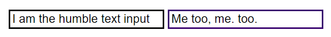
It’s hard to tell, because the color palette uses a dark purple for the highlight color, which is hard to discern from the black border at rest (the colors for both these states have been automatically applied by the browser rendering engine). Having these colors configured so closely in a forced colors palette is unusual, though again: it does force you to consider whether something other than color should be used to disambiguate state. Ensuring that focus outlines are preserved would help.
Ambiguity on used color
SVG elements retain their original colors in forced colors modes, because these can be complex illustrations or documents where such color is important to meaning or entertainment.
In a simple black-on-white theme, you might think that a (non-clickable) SVG icon is rendering with a black fill because it’s picking up the user’s CanvasText color correctly. It is actually rendering in its original fill color. This may cause legibility problems for your visitors with themes that do not use black text, particularly in dark forced colors themes.
For this reason, I recommend even when testing with the full Contrast Themes feature on a PC:
- Test with both light and dark forced colors themes
- Test using a custom scheme with “funky” colors. Never use purple and fuschia in your web content? Put ‘em in a test theme in Contrast Themes. Any issues will be glaringly obvious.
To work around this with emulation, you could add some funky colors to a test stylesheet or inline in the DevTools.
A proposed resolution
The DevTools probably don’t need to go so far as to support completely custom forced color schemes, but it would be nice to have a small selection of themes to help you cover light and dark forced colors, including colors that are less likely to be used in most web content.
Based on browser architectures at play here, the way this was implemented—plumbing in light/dark user agent default stylesheets—makes sense as a first pass. DevTools processes currently have to communicate only that the document should be rendered in a forced colors mode. The renderer process can go ahead and apply forced colors accordingly, using the user agent stylesheet in the absence of a user color scheme detected on the system level.
With theme switching, the DevTools would likely need to communicate a key for the theme that should be used; some logic would need to be added to the rendering engine to draw from a third source of forced colors (these being additional user agent stylesheets that would also need to be stored).
In conclusion
There is still some work left to do before forced colors emulation is great, but the addition of this feature is good news. Developers on non-Windows OS platforms can finally play around with optimizing their web content for forced colors modes, without the use of VPNs or test machines. You may still want to use testing tools like Assistiv Labs to dive deeper into forced colors, but so long as you are aware of the above caveats, DevTools emulation is a great place to start. Thank you to all who contributed on this feature, and making accessibility testing more available to all through emulation!