Learning Log, Aug 2020: 3D Art and Collaging with CSS Grid
Thanks to working from home and having nowhere to go in the evenings, I (like many who are lucky to have a job right now) have been operating under burnout-in-motion this year. I finally forced myself to take a week of staycation in August, and I feel like I could probably have used another week to pay down that overwork debt.
In any case, having some time off at home gave me a good excuse to read a bunch of books and work on some fun personal learning that I hadn’t had time for previously.
I was particularly excited to finally start going through Devon Ko’s 3D for Designers course. As someone who loves math and art, messing with numbers to create imaginary scenes feels…really nice. I don’t think I’ll make hyper-realistic scenes like some other folks do; I prefer a little bit of cuteness and abstraction, partially because that uncanny valley is wide. Partially because I just like it.

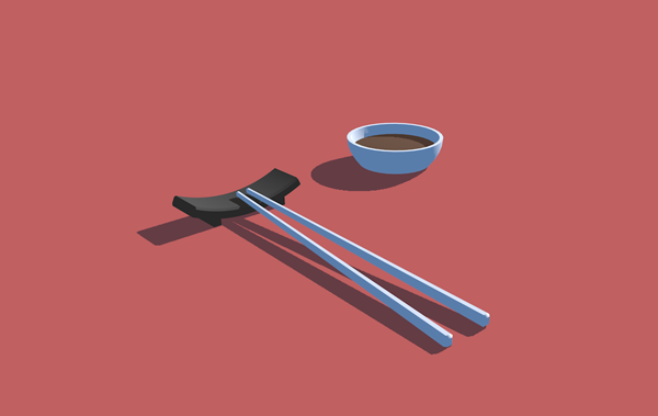
Devon has you model chopsticks as a lesson in how to taper/distort shapes.
If you’ve been interested in learning Cinema4D / how to make 3D art, I really and truly recommend Devon’s course. She manages to ramp you up really quickly with a whole bunch of skills, without making things feel overwhelming. And her casual, upbeat teaching style just makes things fun.
I’m still chipping away at this course, but looking forward to making more stuff! Also super pleased to learn that “gizmo” is an actual term of art in 3D modeling programs.
Personal Website
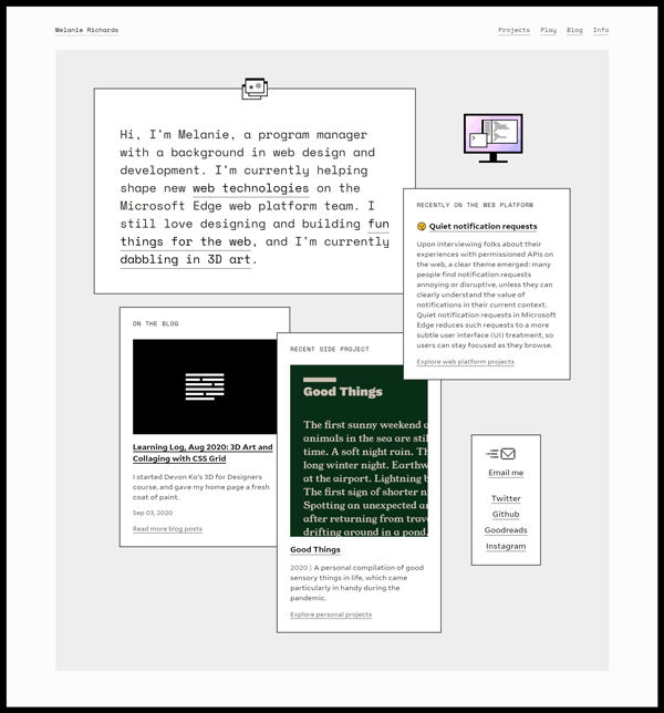
I’ve also been making little tweaks to my site recently, and finally got around to tackling the home page a couple weeks ago. I decided to collage some recent bits together using CSS Grid:

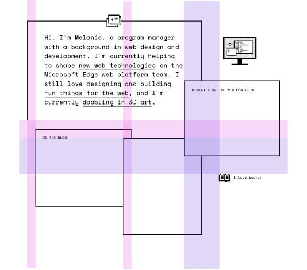
This screenshot from Illustrator demonstrates my squiggly line process on this:

I put just enough detail in Illustrator to figure out what I wanted to build in code. Mostly I needed to figure out where the grid template columns were, in order to facilitate the right grid item spanning / overlapping. The purple bands represent large gaps/overlaps, the pink ones more subtle spacing.
On the Internet
- This adorable bagworm caterpillar
- John Green draws a lot of circles
- Colorful, angular Neo-Andean architecture
- Japanese Grandparents Create Life-Size Totoro With Bus Stop For Their Grandkids
Reading
Web design and development
- Friction Logs: I’ve been making a point of opening documentation issues whenever I hit something, but keeping a log as you go along seems like a good idea.
- The Cicada Principle, revisited with CSS variables: cool strategy for perceived randomness
- Leading-Trim: The Future of Digital Typesetting