More form factors, please!
Designing UI icon sets today can feel somewhat anachronistic: why does a floppy disk still connote save? Why does your TV have antennae? The struggle here is that if we made every icon match the technology it represents, we’d have a lovely bunch of rectangles.
This is changing. Apple just released their Watch, which has a circular, albeit small, interface. The W3C is working on a CSS spec for round displays. The draft proposes a border radius detection approach, which covers rectangles, rounded rectangles, ellipses, and perfect circles; it does not yet propose a solution for more complex display shapes: we’ll cross that bridge when we get to it.
As I read the working draft, 5% of me thought, “oh, great. More complexity.” But the other 95% is SO JAZZED.
First off, it will be interesting to see how web aesthetics change once again to meet the greater variety of screen shapes. With the mobile web we first served up different sites for “mobile” and “desktop”, then moved to responsive (fluid) strategies, and with that, simplified the mainstream aesthetic–not without pushback, off course. Will we see the same pattern with non-rectangular displays? Will we relax the death-grip aesthetics has on traditional design and give more thoughtful attention to UX and content strategy?
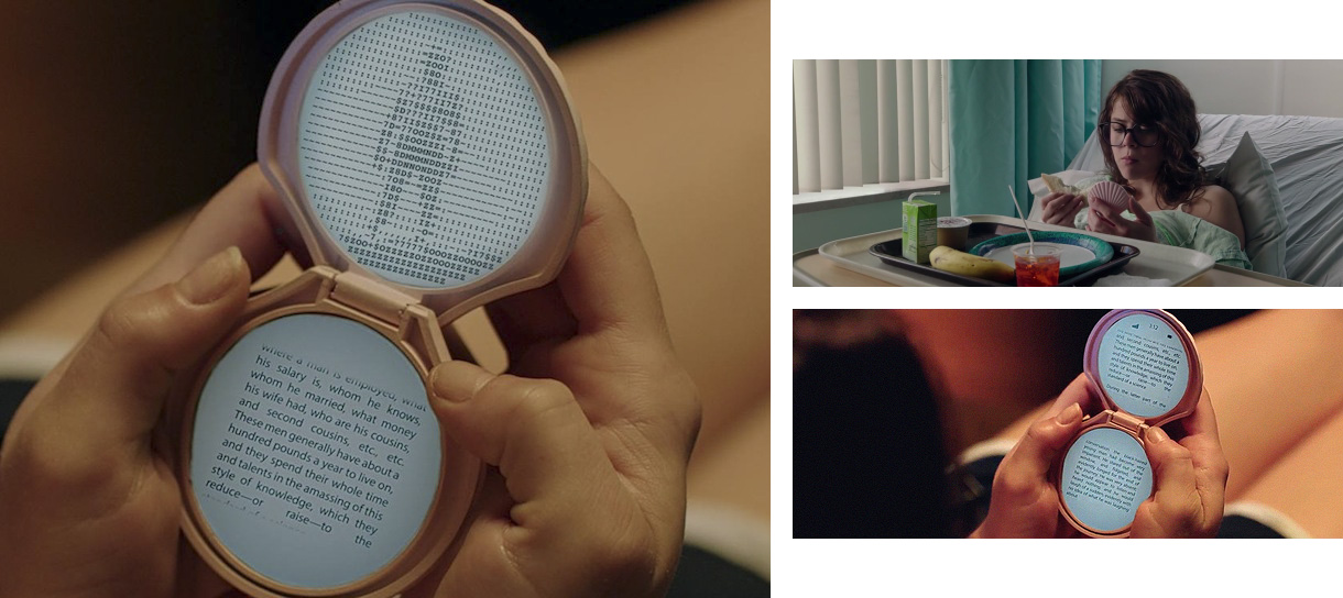
Second, with greater support in the web community for non-rectangular displays, we will see a rise in new, more interesting form factors. Which means maybe someday I can use THIS:

That’s a dual-screen e-reader (phone?) in a bivalve-shell casing, used by the character Yara in the indie horror film It Follows. It appears in all its quirky glory because the director didn’t want to date the film with a specific piece of technology. I want that e-reader badly. And I think someday it could exist.
And this led me down a frenzied wormhole of “what-ifs”:
- What if everyone could express their taste and personality not just in the color of their hardware or protective possibly-Totoro-shaped cases, but in more complex form factors?
- What if you could apply fully-functional screens to other surfaces, like a film? Would we see an explosion of DIY culture around this, much like IKEA hacks?
- What if originality in devices became extremely important to fashion? Would we see a flood of new entrants in the industry from people who feel kind of “whatever” about the slightly-different-rectangle-of-the-year (me)? Would we have more diverse STEM fields?
- What if we had inexpensive devices that look like everyday objects, for at-risk people who need inconspicuous access to help?
- What if a device’s form factor could be designed to meet the specific needs of differently-abled people?
- What if the work already being done in these efforts could be available at accessible prices?
- What if devices could be designed to interlock with other devices, and act as a single computer when brought together (like a patchwork quilt)?
- What if we had industrial/product design college courses devote to designing non-standard devices? What would curious minds come up with, free of the pressure to sell x units?
I can’t wait to see what we’ll come up with.