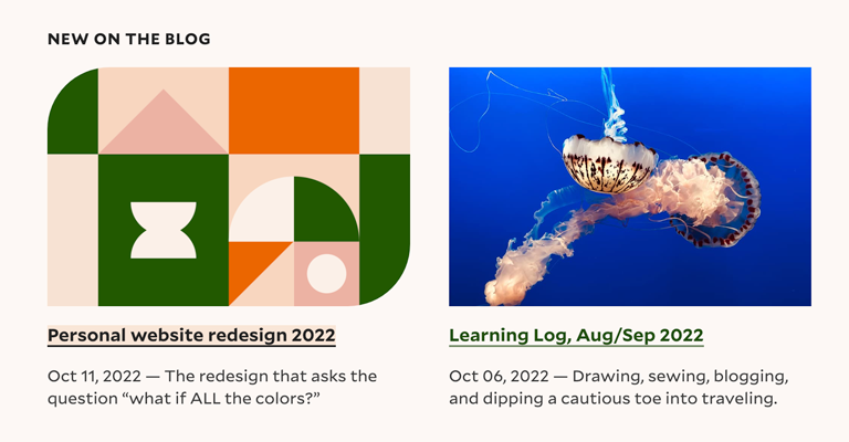
Personal website redesign 2022
For a couple years now, I’ve had a similiar-ish theme up on my website: black-and-white pixel art, Space Mono headings, with body copy rendered in Mallory. Pixels are fun, but I needed a change and craved more COLOR! 🌈
Bright colors have been giving me a ton of dopamine lately, and so this redesign swings far on the other side of the color pendulum:
The blocky, geometric details on this redesign are a nod to the quilting hobby I share with some of my family members: an aesthetic echo of my fiber blog. As a ginger, I’ve gotta incorporate an orangey red in there.
Winter 2020 Version
First, let’s pour one out for the version built in Winter 2020, not long before The Panini. It looked something like this:
There are some through-lines I’m keeping in the new design:
- The Mallory typeface, designed by Tobias Frere-Jones. It’s friendly but well-considered. I am thinking of swapping in a funkier display typeface for headings, but nothing has caught my eye yet.
- Component-level designs: in many ways, components like cards stay the same.
- Content is largely the same, though I’ve split work-related projects into a new Product page, and the blog has tag archives now as well.
New Version
Like my previous design, there is a dark theme:
Previously I would swap out the theme only according to prefers-color-scheme. Now visitors can choose in the footer whether they’d like auto (follow the system theme), light, or dark.
The masthead shapes are a small source of joy for me:
They are reflected in the favicon for that part of the site.
Another detail I love is that when you hover over a card, two opposite corners animate to a bubbly corner radius.
I like how this subliminally points the card image up and left: onwards!
This was also a good excuse to try out the has() selector. In these cards, I'm rendering a pseudo element on the link over the image. This way, the visitor can click on top of the image to navigate (as might be expected), but I can separate out img alt text from the link’s accessible name. Because of this, I needed to select for .c-card:has(.c-card__title:hover) to animate the image’s border radius. Given this is just an aesthetic enhancement, it’s a good first place to try this CSS feature out.
Up Next
Most of the things I’d like to do now are content-related:
- Tag more of my blog posts so they can be found in the right tag categories.
- Add “Uses” and “Media” pages for some good ol’ fashioned navel-gazing/voyeurism.
- Develop the Product page more: thought leadership? Do I dare?
While I’ve done visual / accessibility testing in this redesign process, it’s always possible I’ve missed something. Please do let me know if you find anything that seems off!