Seasonal Cleaning Vol II
Earlier this year I started a new practice called seasonal cleaning, in which I make little improvements to my existing side projects, workflow, tooling, etc. A lot of this is driven out of an account-wide Github project board.
Though I did update a couple counts on my bucketlist, I focused almost exclusively on my highlights minisite this go around:

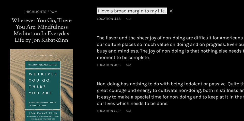
- Whenever you invoke a highlight permalink and scroll it into view, the highlight would butt up right against the top of the viewport. I added a bit of margin to an individual highlight’s scroll snap area using
scroll-margin-top. Now there’s a little bit of breathing room. - I also made the permalinked highlight background color a little bit less harsh. What was pure white (
#fff) is now a very light grey (#ececec). It’s a subtle distinction, but I think it’s an improvement for many pairs of eyeballs, especially when reading long highlights.
I added pagination to the home page. You won’t actually notice that yet, because there’s 24 posts per page. Soon! I didn’t have pagination on the home page before because the site used to run on Jekyll. In order to have more than one paginated page with Jekyll, you need a plugin, which at the time was disallowed on Github Pages (my deployment environment at the time). As of November, I’m using Eleventy for my SSR and deploying to Netlify. Adding pagination in this environment was fairly trivial.
I updated the favicon so that it’s more friendly to browser UI rendered in various color modes. Previously, the favicon was a static png holding a black ribbon icon. The change here entails using an SVG favicon, and querying for prefers-color-scheme and forced-colors within the SVG to target dark mode and Windows high contrast. Here’s the code snippet.
For forced colors, I optimized for Microsoft Edge UI. The background of the favicon is Highlight, and the SVG fill is HighlightText. This means the icon blends into the background of the tab when the tab is activated:
![]()
It does look slightly less nice when the tab is inactive:
![]()
I played around first with just having a transparent background and CanvasText (normal, unhighlighted text color) foreground or HighlightText foreground. But generally speaking you could potentially run into some visibility issues if you mismatch system colors used for different states. For example, some high contrast themes have a light text color, a dark highlight text color, and a light highlight background color. In those cases the light text color on top of the light highlight background color would be hard to make out.
In content, I added some new highlights for David Chang’s Eat a Peach and am about halfway through the work to add Dara Horn’s Eternal Life.

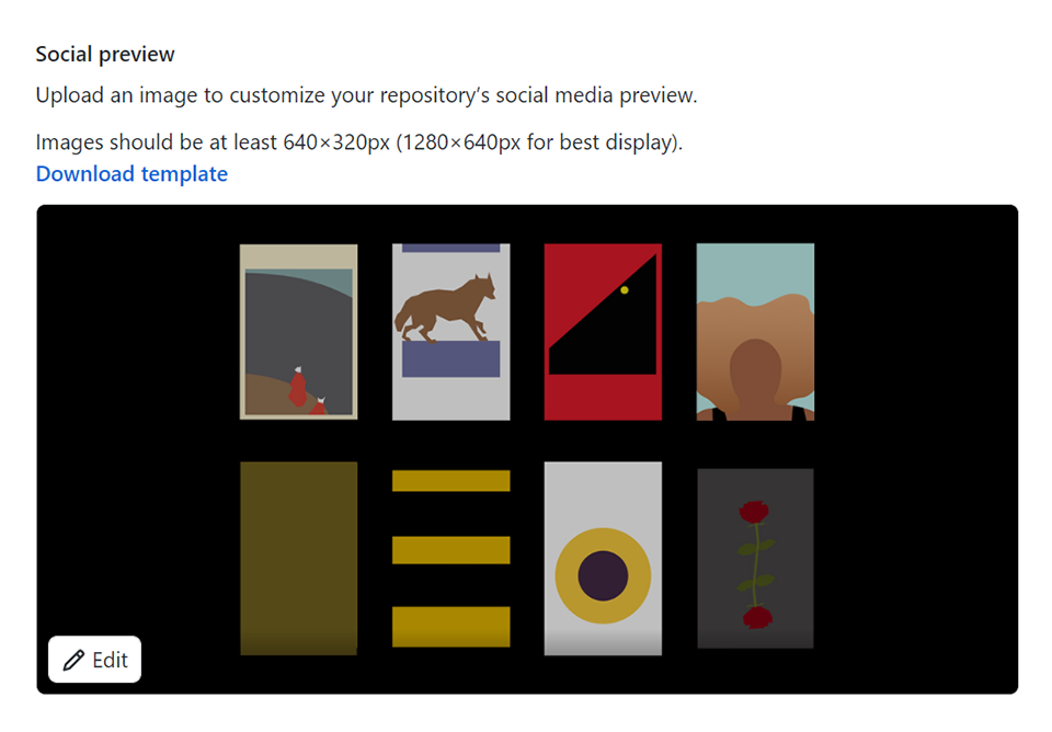
And finally, I added a “social preview” image to the repo settings in Github, because it is so awkward when Twitter share cards have a giant avatar of your own face.