Blog
I blog about the web platform, web design and development, accessibility, product management, and artsy side quests. I also have a monthly “Learning Log” practice, where I collect articles I’m reading or things I’m learning.
Subscribe to RSS feed-
 Learning Log, Jul 2021
-
Learning Log, Jun 2021 + Seasonal Cleaning IV
-
 Call for web dev feedback: anchored positioning use cases + requirements
-
 Learning Log, May 2021
-
 Proposal: CSS Anchored Positioning
-
 Available for preview: Automatic HTTPS helps keep your browsing more secure
-
 Learning Log, Apr 2021
-
Seasonal Cleaning Vol III
-
 Learning Log, Mar 2021
-
 Learning Log, Feb 2021
-
 A fiber crafts blog and JAMstack comments
-
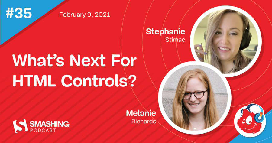 “What’s Next For HTML Controls?” on Smashing Podcast